Choosing the right color combination for interior spaces can truly transform your home from ordinary to extraordinary. While many people use it safely with traditional palettes, exploring unexpected pairings often results in surprisingly stunning rooms. Imagine colors you never thought could coexist peacefully, suddenly creating harmony and depth in your living spaces. These bold yet thoughtful combinations can enhance mood, add personality, and make your interior design stand out. Ready to step outside the color comfort zone? Here are 10 unexpected color combinations for interior that actually work, providing inspiration to help you confidently reinvent your home with flair and creativity.
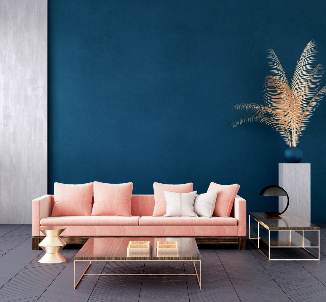
Navy Blue and Pink
Navy blue paired with pink creates a balanced and visually captivating color combination for interior spaces, harmoniously blending elements of masculinity and femininity. In line with current colour trends, interior designers frequently employ this duo in children’s bedrooms, master suites, and contemporary living rooms, where the combination effortlessly enhances modern aesthetics. Navy blue offers a solid, trustworthy foundation, strongly associated with stability and confidence, as confirmed by color psychology experts.
Navy blue has remained one of the most preferred colors, admired for its ability to anchor spaces. Meanwhile, soft pink infuses warmth, compassion, and nurturing qualities, creating a calming environment. The blend of these hues, grounded in complementary color theory, forms an appealing and dynamic palette suitable for diverse contemporary living room furniture styles.
Olive Green and Mustard Yellow
Olive green combined with mustard yellow results in a natural, serene color combination for interior spaces, perfectly capturing the essence of current colour trends that embrace earthy, organic palettes. These colors are ideal for creating cozy yet invigorating spaces, particularly effective when paired with contemporary living room furniture.
Olive green promotes harmony, peace, and a deep sense of connection to nature, while mustard yellow energizes interiors with brightness and optimism, stimulating creativity and mental alertness. Exposure to nature-inspired colors significantly reduces stress, enhancing emotional well-being.
Interior design trends indicate a notable surge in searches for olive-green decor, reinforcing its widespread appeal. This earthy pairing, reminiscent of autumnal scenes, naturally evokes visual comfort and emotional balance, making it both stylish and beneficial for mental health.

Green fosters harmony and balance, establishing a peaceful atmosphere, while yellow enhances mental activity and optimism, bringing energy and brightness to the room.
Charcoal Gray and Teal
The combination of charcoal gray and teal provides interiors with a sophisticated yet vibrant appeal, aligning seamlessly with current colour trends. Popular in contemporary homes, particularly in spaces featuring contemporary living room furniture, this pairing effortlessly elevates the ambiance of living rooms, offices, and bathrooms.
Charcoal gray serves as an elegant and versatile neutral backdrop, known for creating calm and balanced environments. Gray’s enduring popularity is recognized for its ability to let other hues, especially bold tones, shine. Teal, a dynamic blend of calming blue and rejuvenating green, injects personality, depth, and freshness into the design.
Teal is also a preferred choice due to its balancing and revitalizing properties. Rooted in complementary color principles, teal and charcoal gray offer a visually stimulating yet balanced color combination for interior spaces, suitable for varied design preferences.
Burgundy and Sage Green
Burgundy and sage green form an elegant yet comforting color combination for interior spaces, reminiscent of lush wine-country landscapes. Burgundy conveys a deep sense of luxury and sophistication, adding a refined richness ideal for styling a brown leather couch, especially within spaces featuring classic furniture pieces like an expansive u shape sofa. Meanwhile, sage green introduces tranquility and a refreshing connection to nature, balancing the intensity of burgundy.
According to color psychology, burgundy symbolizes ambition and depth, whereas sage green encourages peace and growth. Historically, this pairing was popular in Victorian interiors, widely appreciated for its depth, complexity, and timeless charm. Modern interior designers continue to embrace this duo, particularly favored in upscale renovations and period-inspired home decor.

These colors evoke the richness of wine country landscapes, creating a warm and inviting ambiance.
Lavender and Chocolate Brown
The unexpected yet harmonious combination of lavender and chocolate brown creates a sophisticated yet cozy atmosphere, presenting a fresh take on traditional palettes. Lavender, celebrated for its soothing, tranquil qualities, contrasts beautifully with chocolate brown, a color symbolizing reliability, warmth, and comfort, ideal when styling a brown leather couch in contemporary interiors.
This striking balance of cool and warm tones makes it a versatile color combination for interior design, particularly effective in spaces furnished with luxurious seating arrangements like a plush u shape sofa. As supported by design psychology, pairing light and dark shades increases visual interest, drawing attention without overwhelming the senses. Increased interest in unique, calming color palettes, with lavender prominently featured due to its restful properties, further validating this pairing’s rising popularity.
Coral and Mint Green
Coral and mint green combine to deliver a vibrant and refreshing tropical-inspired color combination for interior spaces, infusing rooms with energy and clarity. Coral introduces enthusiasm, warmth, and liveliness, perfectly complemented by mint green’s calming, crisp, and clean ambiance.
This energetic duo suits styling a brown leather couch by introducing playful accents and lively cushions, beautifully highlighting contemporary furniture configurations such as a spacious sofa. Often appearing in lush tropical flora, coral and mint green reflect the natural harmony found in vibrant, exotic environments. Coral has surged in popularity for adding vibrant warmth to interiors, while mint green continues to be praised for its fresh, clean aesthetic, ideal in kitchens, bathrooms, and living rooms aiming to evoke an atmosphere of renewal and freshness.

Another vibrant combination is coral and mint green, which brings a fresh, tropical ambiance to any space.
Plum and Gold
The color combination for interior spaces featuring plum and gold instantly evokes luxury, elegance, and historical grandeur. Plum, a rich shade of purple, has traditionally symbolized royalty, creativity, and opulence. When paired with gold, a timeless representation of success and prestige, this duo elevates any room, giving it an undeniably regal ambiance.
Historically, this pairing has been prominent in royal palaces and sacred spaces, emphasizing its significance and enduring allure. Imagine a spacious living room with plum-colored walls, beautifully complemented by gold accents such as gilded frames, ornate lamps, and sophisticated decor pieces. Enhanced further by an elegant sofa upholstered in luxurious plum fabric accented with gold-trimmed cushions, this combination transforms ordinary spaces into sophisticated interiors that radiate charm, depth, and historical richness.
Terracotta and Sky Blue
Terracotta paired with sky blue creates a visually soothing yet vibrant color combination for interior designs, capturing the essence of Mediterranean-inspired beauty. Terracotta introduces a warm, earthy quality, grounding the room with an inviting coziness, while sky blue evokes openness, tranquility, and airy comfort.
This pairing enhances mental wellness by bringing natural elements indoors, effectively promoting relaxation and emotional balance. Imagine styling a contemporary living room featuring terracotta-painted walls harmoniously contrasted by sky blue accents such as cushions, throws, and ceramic decorations.
A spacious sofa in neutral tones further emphasizes this balance, anchoring the room while highlighting these complementary hues. This combination not only offers aesthetic beauty but also a deeper connection to nature, making it an excellent choice for nurturing and calming interior environments.
Forest Green and Peach
Forest green and peach blend harmoniously to form a balanced and visually appealing color combination for interior spaces, effectively merging depth with softness. Forest green, reminiscent of lush natural landscapes, symbolizes balance and serenity, ideal for creating restful and calming spaces. Peach complements this intensity by infusing warmth, comfort, and an inviting atmosphere.
According to color theory, this pairing follows a split-complementary scheme known for its visually stimulating yet balanced effect. Picture a bedroom where deep forest green walls set a tranquil mood, softened by peach-colored bedding, curtains, and accessories.
Completing the look with a plush sofa upholstered in soft peach tones or adorned with green and peach throw pillows further reinforces this peaceful balance. This thoughtful combination not only elevates the aesthetic appeal but also aligns perfectly with contemporary design preferences that emphasize comfort, harmony, and visual serenity.
Slate Blue and Marigold
Slate blue combined with marigold creates a dynamic yet sophisticated color combination for interior spaces, perfectly suited for energizing yet calming environments. Slate blue provides a calming foundation, known to promote concentration, clarity, and relaxation, making it ideal for spaces requiring focus and productivity.
In contrast, marigold introduces vibrant warmth and positivity, stimulating creativity and optimism. According to renowned colorist Leatrice Eiseman, blue-yellow pairings effectively create a lively yet balanced atmosphere, enhancing mood and productivity. Envision a home office painted in soft slate blue walls, vividly accented by marigold-colored decor items such as desk accessories, artwork, and textiles.
Including a contemporary sofa in a neutral shade, highlighted with marigold and slate blue pillows, enhances comfort and visual cohesion. This energetic yet harmonious pairing transforms interior spaces into engaging, uplifting environments, perfectly balancing calmness with invigorating warmth.

Slate blue, with its cool and calming effect, encourages focus and relaxation, while marigold, a warm and lively hue, inspires optimism and creativity.
Color Combination Tips
Selecting the right color combination for interior spaces requires thoughtful consideration, helping you create visually appealing rooms that feel both balanced and inviting.
Use the 60-30-10 Rule
The 60-30-10 rule is a classic interior design principle widely used to achieve a balanced and cohesive aesthetic. In this approach, 60% of your room should be dominated by one primary color, usually applied to large areas such as walls, significant furniture pieces, and expansive rugs. Next, incorporate a secondary color making up about 30% of the space, this hue complements and enhances the dominant shade, adding visual interest through smaller furniture, upholstery, and curtains. Lastly, dedicate around 10% to an accent color, strategically used in accessories like decorative cushions, artwork, and small decor pieces to introduce vibrant pops of interest.
Distribute Colors Across Different Elements
To create a harmonious color combination for interior designs, carefully distribute your chosen colors across various room elements. Start with paint or wallpaper to establish the primary color tone of the room, setting a foundational mood. Then, utilize large furniture items to anchor your dominant or secondary hues effectively. Introduce secondary and accent shades through textiles such as rugs, curtains, and cushions, enhancing the layered depth of the interior. Finally, decorative accents like lamps, artwork, or vases can subtly highlight your accent color, tying the overall design together beautifully.
Balance Bold Colors with Neutrals
While bold colors bring personality and excitement to interior spaces, overusing them can quickly overwhelm the senses. To prevent this, incorporate neutral shades such as whites, grays, beige tones, or soft pastels. These neutrals offer calming visual relief and act as excellent backgrounds for more vibrant, bold accessories or furniture pieces. Balancing bold hues with neutrals ensures your interior remains vibrant yet pleasantly harmonious, enhancing both comfort and aesthetic appeal.
Consider Emotions and Room Functionality
Colors significantly influence emotions and behaviors, making it essential to choose appropriate shades based on the room's intended purpose. For instance, bedrooms benefit greatly from calming hues like blues or greens, creating a restful environment ideal for relaxation. Living rooms, however, thrive with warm and inviting tones such as soft yellows, warm grays, or earthy browns, encouraging social interaction and comfort. Home offices function best when painted in muted blues or greens, known to boost productivity, concentration, and mental clarity, thereby maximizing efficiency and focus.
Use Light and Dark Shades Strategically
Using lighter shades in smaller rooms and darker tones in larger spaces effectively influences the perception of space. Light pastels, soft neutrals, and whites make small interiors appear larger and more open, enhancing a sense of spaciousness and brightness. Conversely, employing deeper shades like dark grays, rich greens, or navy blues can make expansive rooms feel cozier, intimate, and welcoming, reducing any feelings of emptiness or coldness. Strategic shade selection helps ensure your chosen color combination for interior settings enhances rather than detracts from the space's overall feeling and functionality.
Test Colors Under Actual Lighting Conditions
Since lighting significantly affects color perception, testing your selected colors in the actual space is crucial before finalizing decisions. Paint a small section of your wall or utilize large color swatches to observe how hues shift in different lighting scenarios throughout the day. Examine these colors in natural daylight, artificial light, and evening lighting conditions to ensure they consistently meet your expectations. This step guarantees your chosen color combination for interior spaces looks appealing and harmonious under all circumstances, leading to a satisfying final result.
Stepping outside traditional palettes allows you to create unique spaces that feel inviting and truly reflect your individuality. Visit COZY today and discover furniture that perfectly matches these distinctive color combinations. Our expertly crafted pieces promise comfort, elegance, and durability, ensuring your home feels as extraordinary as it looks.